Chicago Public Art Group
Case Study Overview.
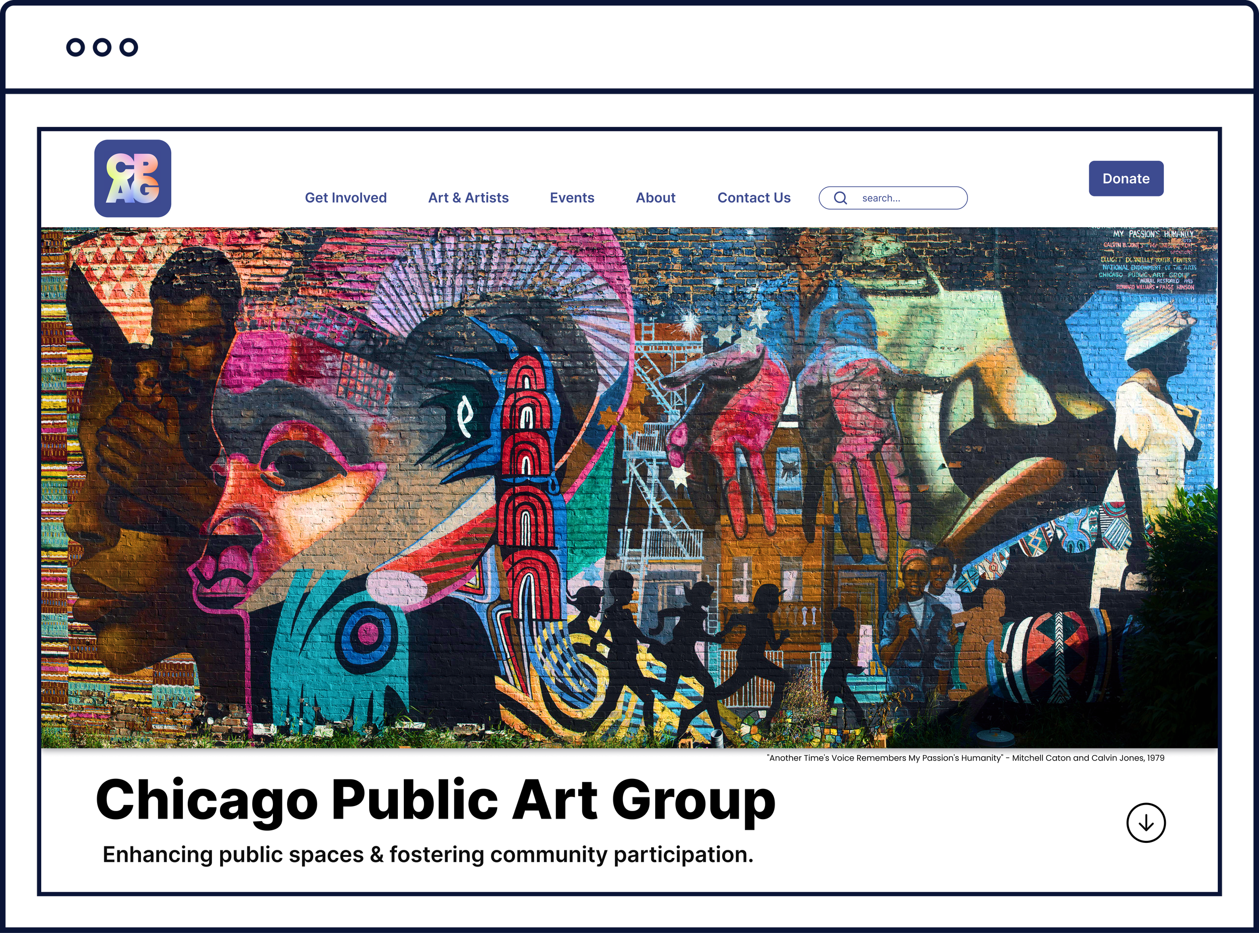
As a native Chicagoan who is passionate about the arts, I was eager to redesign the website of one of the Windy City’s art non-profit organizations. The Chicago Public Art Group (CPAG) was founded over 50 years ago, and prides itself on having fresh energy while preserving its unique legacy.
CPAG believes that public art encourages widespread community investment and that engaging with art should be accessible to all.
Role
UX Design & Research
Team.
Regan O. & Derek Y.
Tools.
Figma, Figjam, Adobe Illustrator
Original Website.

Initial Analysis.
What’s Working.
beautiful images
overall functionality
showcasing artists
clear brand
clean interface
not enough calls-to-action
low visitor conversion
too much text - hard to skim
user journey not far-reaching
inconsistent design
What Needs Work.
Next Steps.
Research
Ideate
Design
Iterate
Conduct user interviews to gain qualitative information about our users
Create a persona that encompasses our target audience
Understand what our user journeys look like
Conduct content testing to determine how users retain information
Research Overview.
After forming a list of questions that would help us gather necessary qualitative data, our team interviewed 5 Chicago-based users from varied backgrounds.
We each wrote down the responses from the interviews on virtual sticky notes so that we could look at this qualitative data as a whole. Working together, our team sorted and categorized the sticky notes in an affinity diagram so that we could pinpoint our users’ needs and pain points.
From synthesizing this qualitative data, we developed both a user persona and an empathy map to further help us determine how to redesign CPAG’s website
User Interviews.
User Persona

Affinity Diagram

In order to emphasize involvement, we needed to examine CPAG’s existing sitemap to determine how to build a more streamlined user flow.
After a successful card sorting session, our team developed a new sitemap for CPAG - focusing on calls-to-action for involvement.
To decrease drop-off rate and create a more streamlined flow, we reduced clicks by simplifying the navigation menu and eliminating drop-down tabs.
Information Architecture.
Original Sitemap

New Sitemap

Before designing and prototyping the new CPAG site, our team conducted content testing to decipher how our users retain information while browsing
In order to complete the content testing, I built grayscale and image-less wireframes containing identical formatting and copy from CPAG’s existing site.
Content Testing.


Our team conducted 5 content tests by asking our users to quickly skim through the text on each page, and then report 3-5 pieces of information that they learned.
The results of these content tests were clear and unanimous - CPAG’s existing site contained too much text, making it extremely difficult for users to skim the pages and retain important information.
Insights.
Meeting accessibility standards, I developed a brand and UI style guide that revamps and unifies CPAG’s existing brand identity.
Design Solutions.


After consolidating the majority of copy found of CPAG’s existing site and following the improved sitemap, our team began building a low-fidelity clickable prototype.
Notable actions:
consolidated similar pages
more calls-to-action
simplified main navigation menu
better content chunking
Prototyping.


Before we began developing our high-fidelity prototype of CPAG’s site, our team conducted usability tests to understand what needed iterating and how users interacted with our prototype.
Findings:
need to add more buttons for calls-to-action
re-order tabs in navigation to emphasize “get involved” journey
add more micro-interactions
minor usability errors with system
Usability Testing.
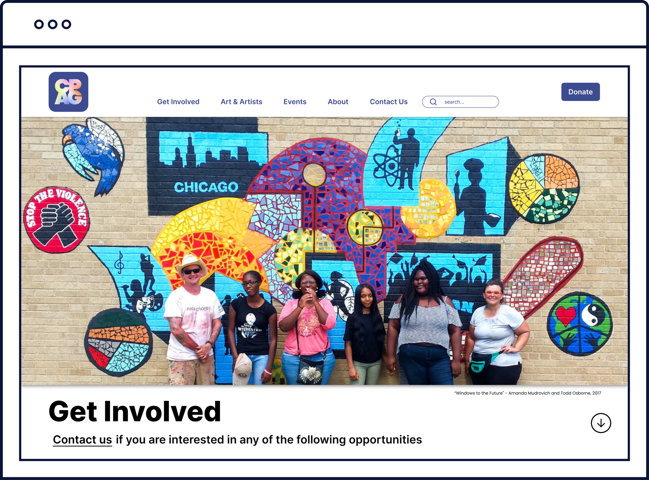
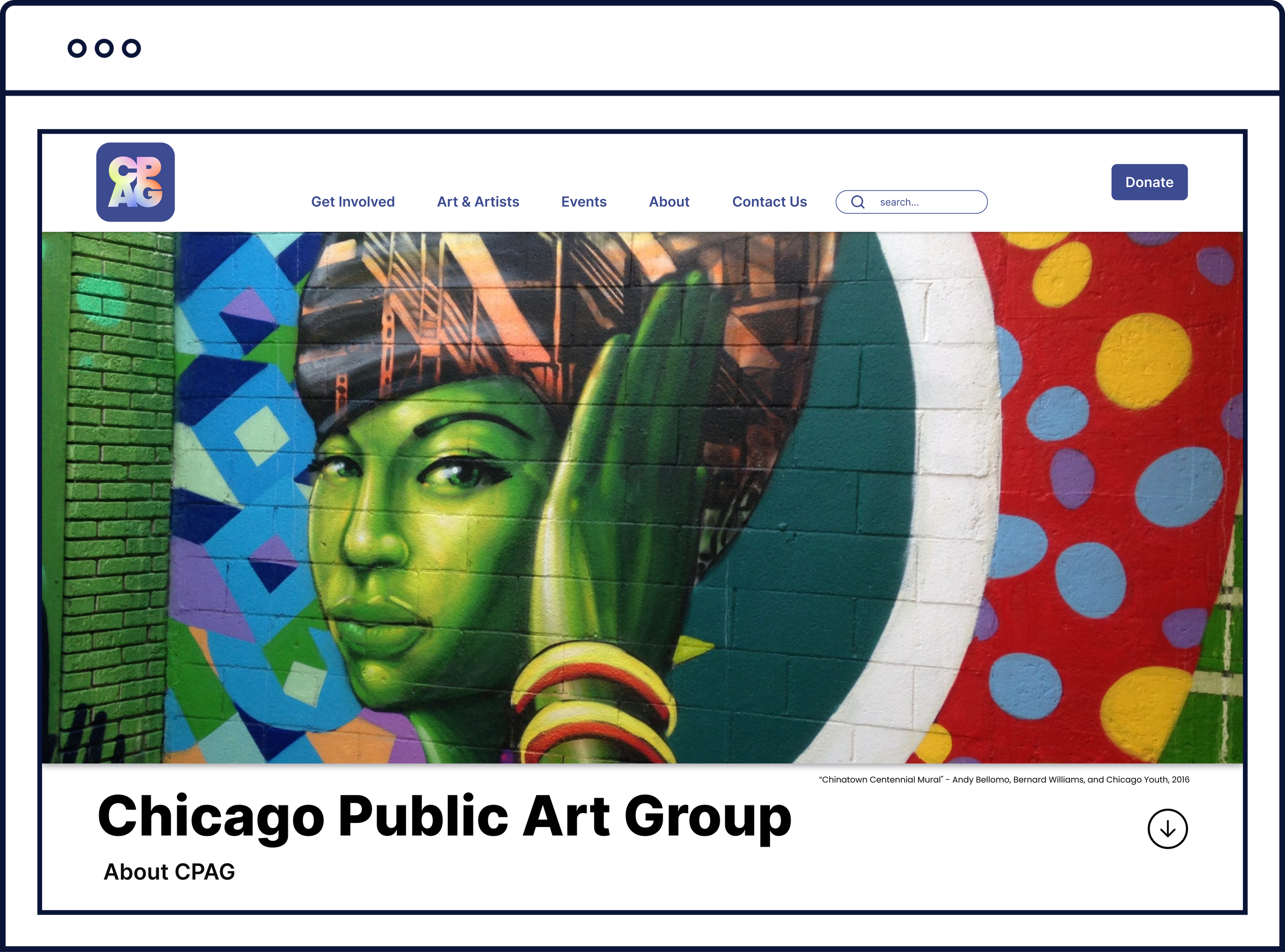
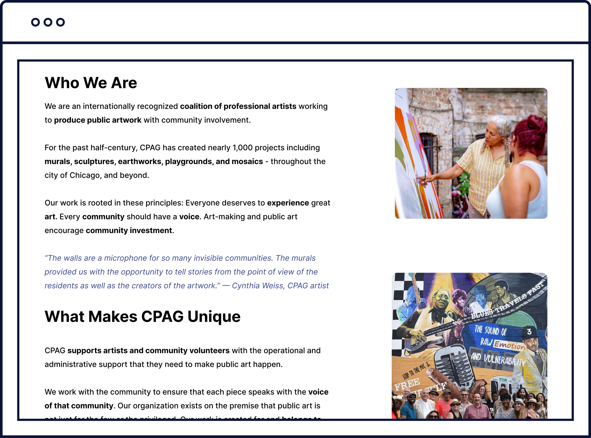
Closely following our brand and UI style guide, research findings, and low-fidelity prototype, our team created both mobile and desktop high-fidelity clickable prototypes of CPAG’s website.
