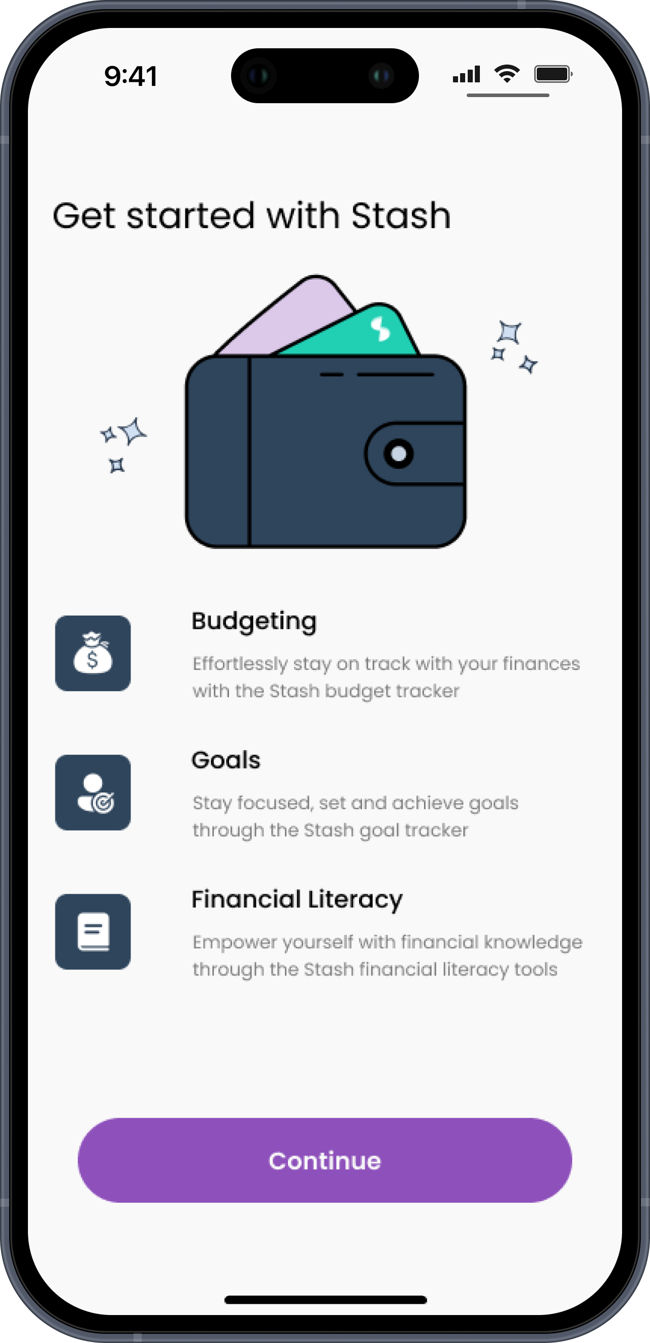
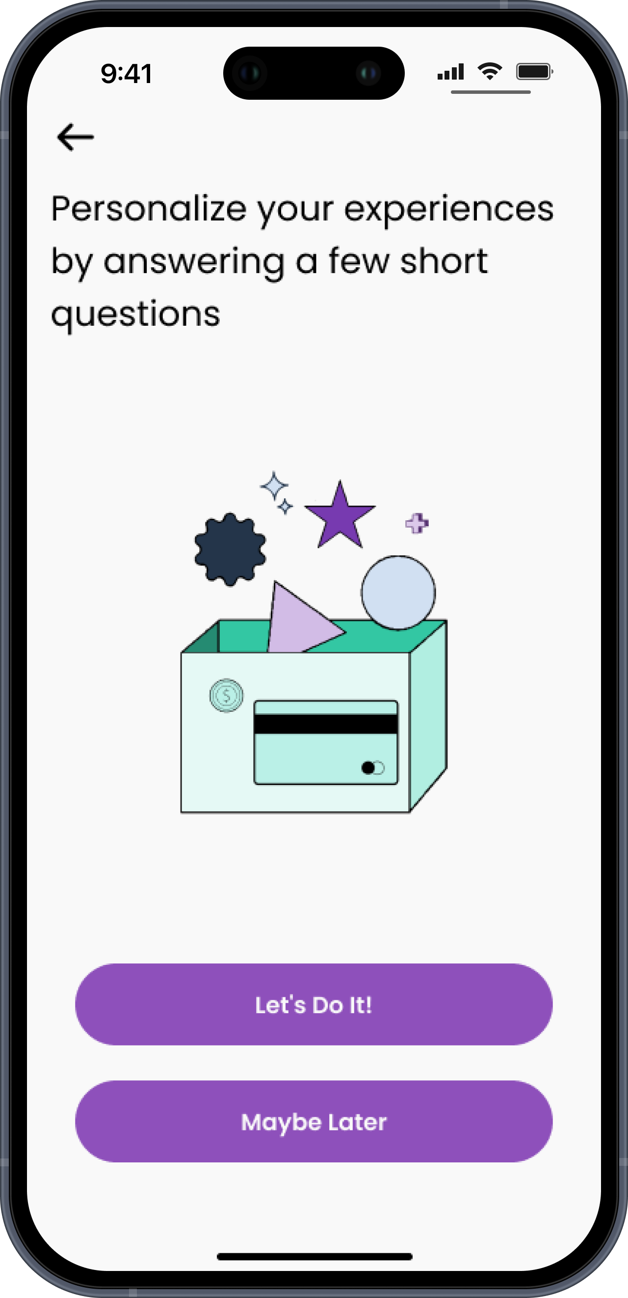
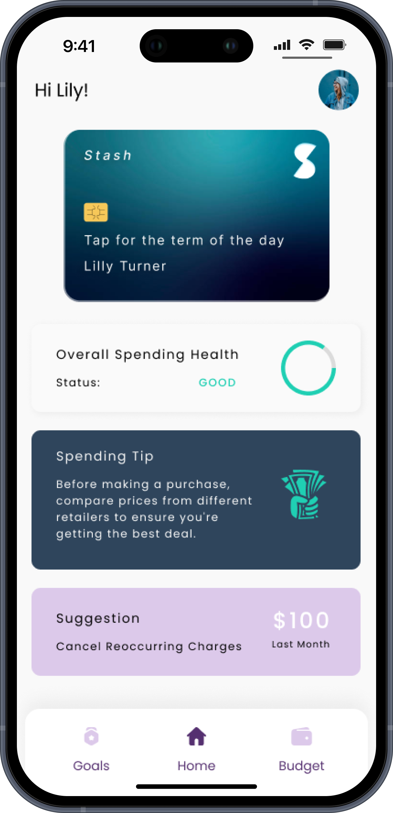
Stash
Overview.
Stash encourages young adults to save money, be accountable for their financial goals, and increase their financial literacy.
Young adults often have a difficult time creating and sticking to a budget. young adults are intimidated with managing personal finances and need help budgeting.
Role.
UX Design & Research
Team.
Anita, BJ, Taty, Zach
Tools.
Figma, Figjam, Adobe Illustrator
Approach.
Research
Ideate
Design
Iterate
Problem Statement.
Stash wants to empower young adults in navigating the challenging topic of personal finance. Each individual’s monetary situation is unique and is often a taboo, leaving many insecure about their finances.
By integrating resources into an interaction tool, Stash aims to transform the learning experience for young adults, amplifying financial literacy for everyone.
Conduct user interviews to gain qualitative information about our users
Form a persona that encompasses our target audience
Determine what features to include in the application
Understand financial priorities of our users
Research Overview.
Target audience: 16-25 yrs.
Want to understand:
Young adults’ relationship with money
Motivations to save/invest/spend
Fears regarding money & finances
Pain points with financial literacy
User Interviews.

Select Interview Quotes
User Persona

Understanding Our Users
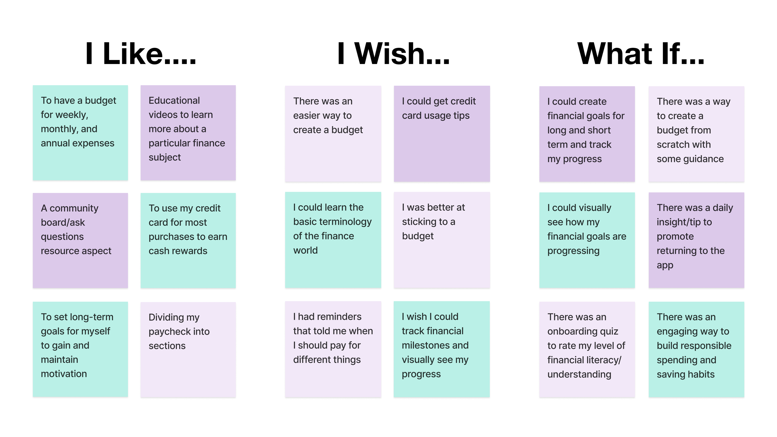
Feature Prioritization Matrix.

Storyboard

Competitor Analysis

User Flows.
Understanding the goals and needs of our target user group, our team compiled a list of features for Stash.
After brainstorming and creating a feature prioritization matrix, we decided on the main features for Stash, and created user flows to show the a Stash user’s journey in the onboarding process, creating a budget, and learning Stash’s financial “Term of the Day”.
User Flow - Onboarding

User Flow - Create a Budget

User Flow - Term of the Day

Flow 1:
3 informational screens showing app’s features
4 questionnaire screens
Flow 2:
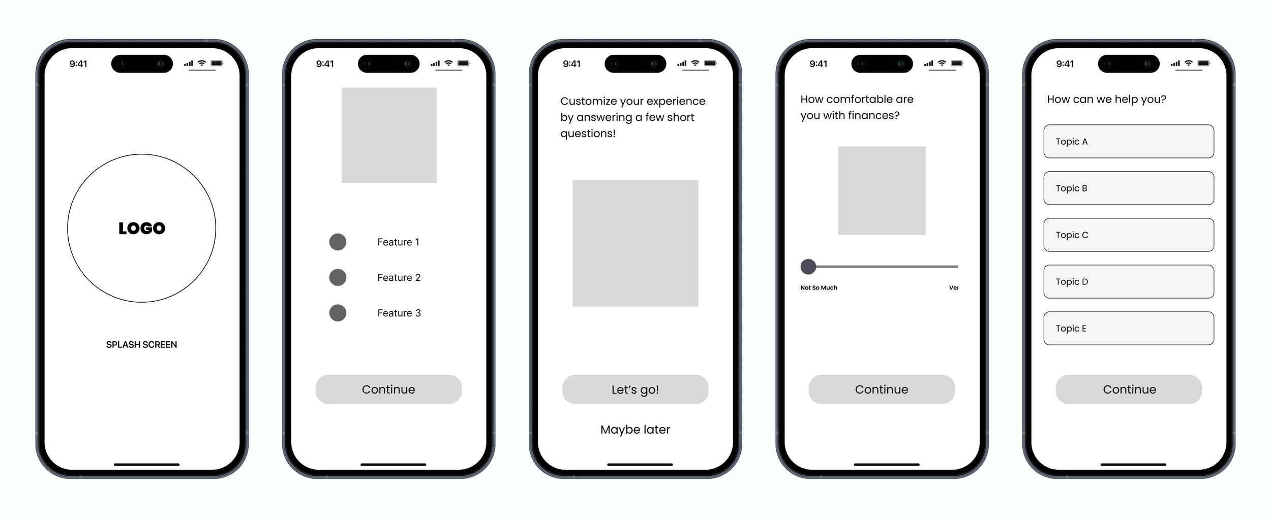
1 screen with list of app’s features
1 screen with scale slider for user self-rating
1 screen with clickable topics for customization
1 screen for users to choose areas of interest
1 affirmation screen that leads to sign up/log in
1 sign up/log in screen
Wireframing.

Our team conducted user testing using A/B method
5 users clicked through both Flow 1 and Flow 2 with no guidance
Users were asked which flow they preferred
Findings:
All 5 users preferred Flow 2
Reasons: less screens, more action-oriented, option to return later
User Testing.
Low Fidelity Prototype.

Meeting accessibility standards, we developed a brand and UI style guide for Stash that is young, fresh, and inviting.
Brand & UI Guide.


Closely following our brand and UI style guide, research findings, and low-fidelity prototype, our team created a high fidelity, clickable prototype of Stash.
Final Prototype.
Conclusions.
Future Goals
What We Learned
Simple is better
Always remember the problem that needs to be solved
The value of A/B testing
Success Metrics
Downloads/Onboarding
Consistent app use to build positive habits
Completing savings/spending goals
More user testing
Interactive learning tools
Reminders and notifications for recurring payments
